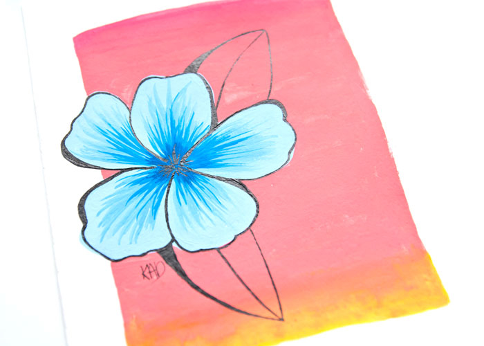
I’ve started to notice that some of the projects I’ve been sharing with you this year have been very lead by color combination. So today I thought I would lean fully into it and show you a study that I did recently that was completely lead by the colors. In fact the art is not at all important in this piece it was more about mixing the colors and trying them out, plus finding the right materials to get the look that was in my head out onto paper.
So if you have a color combination stuck in your head at the moment let me know what it is, because I am always curious! And hopefully this video will give you some ideas and tips on how to test that color combo out ready for your next project!
Don’t forget that the products are all listed under the video if you are interested in what I used and the color names!
VIDEO: How To Use A Color Combination To Inspire Your Art
——— S U P P L I E S ———
Turner Acryl Gouache Paint ( Coral Red, White, Black Japanesque Deep Yellow)
Winsor and Newton Designers Gouache Paint (Primary Yellow, Magenta, Primary Blue)
Mixed Media Artist Paper (160gsm/ 98lb)
Round brushes sizes 3/0, 2 and 6
Glass Dip Pen
Winsor and Newton Indian ink (the Water-resistant one) (aka india ink/ Chinese ink/ China ink)

If you wanted a bit of an art motif refresher then watch my video and I have tips in that video to help you realise what your art motifs are and how to get out of art motif ruts!
And if you are looking for more ideas then try my videos and/or myideas videos! Grab a coffee! It’s video time!
Have a super creative day and don’t forget to let me know if you would like that unboxing video!
Kim